使用字体
Godot 中能够为不同的 UI 节点设置指定的字体。
有三种不同的地方都可以设置字体。第一个地方是主题编辑器,选择要设置字体的节点后选择字体选项卡即可。第二个地方是控件节点的检查器,在 Theme Overrides > Fonts 中设置。最后是主题的检查器,在 Default Font 中设置。
如果其他地方都没有指定字体覆盖项,那么就会使用 Open Sans SemiBold 作为默认的项目字体。
备注
从 Godot 4.0 开始,字体的大小不再随字体本身指定,而是在使用字体的节点中定义。可以在检查器的 Theme Overrides > Font Sizes 中找到。
这样修改字体大小的时候就不必为每种字体大小复制字体一份资源了。
字体文件有两种:动态字体(TTF/OTF/WOFF/WOFF2 格式)和位图字体(BMFont .fnt 格式或等宽图像)。动态字体是最常用的,因为可以调整字体大小,即便很大也能保持清晰。与位图字体相比,动态字体由于基于向量,所以可以在包含更多字形的同时保持合理的文件大小。动态字体还支持位图字体无法支持的一些高级功能,例如合字(将若干字符转换为专门设计的单一字符)。
小技巧
你可以在 Google Fonts、Font Library等网站找到免费授权的字体文件。
字体是受版权保护的。使用前请仔细检查字体的许可证,因为并非所有字体都允许在不购买许可证的情况下用于商业用途。
参见
你可以使用 BiDI 和字体特性演示项目在实践中了解字体的工作原理。
动态字体
Godot 支持以下动态字体格式:
TrueType 字体或合集(
.ttf、.ttc)OpenType 字体或合集(
.otf、.otc)Web 开放字体格式 1(
.woff)Web 开放字体格式 2(
.woff2,从 Godot 3.5 开始支持)
虽然 .woff 尤其是 .woff2 的文件往往更小,但并不存在普遍“更好”的字体格式。大多数情况下建议使用字体开发者网站上提供的字体格式。
位图字体
Godot 支持 BMFont(.fnt)位图字体格式。这种格式是由 BMFont 程序创造的。与 BMFont 兼容的程序也有很多,比如 BMGlyph 和 Web 版的 fontcutter。
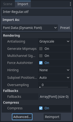
你还可以将任意图像作为位图字体导入。这种做法仅支持等宽字体(每个字符都一样宽的字体)。使用方法是在“文件系统”面板中选中图像,然后切换到“导入”面板,将导入类型切换为 Font Data (Monospace Image Font) 然后点击重新导入:
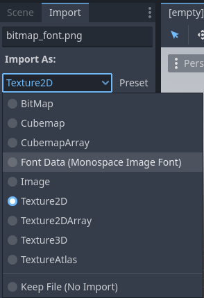
将导入类型修改为 Font Data (Monospace Image Font)
字体可以使用任意顺序的字符集布局,但建议使用与标准 Unicode 一致的顺序,这样导入所需的配置就会少很多。例如,下面的位图字体包含了 ASCII 字符,与标准 ASCII 顺序一致:
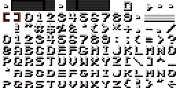
Credit: LibreQuake (scaled and cropped to exclude extended range)
使用以下导入选项即可成功导入上述字体图像:
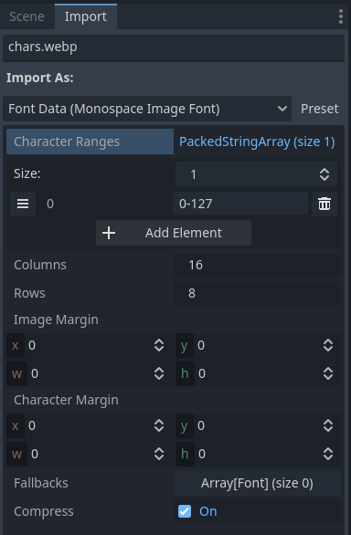
上面的示例字体使用的导入选项
字符范围选项是一个数组,对应图像上的各个位置(单位为图块坐标,并非像素)。字体图集的遍历顺序是从左到右、从上到下。字符的指定方式可以是十进制数组(127)、十六进制数字(0x007f)或使用西文单引号包围('~')。可以用西文横杠指定字符之间的范围。
例如 0-127(或 0x0000-0x007f)指定的就是整个 ASCII 的范围。再比如 ' '-'~' 就等价于 32-127,代表可打印(可见)的 ASCII 字符范围。
请确保字符范围不超过列数 × 行数所定义的数量。否则导入字体会失败。
如果字体图像中包含未用于字体字形的边距(如署名信息),请尝试调整图像边距。该边距只会在完整图像周围应用一次。
如果字体图像中包含辅助线(画在字形之间)或者字符间距看上去有问题,请尝试调整字符边距。每个导入的字形都会应用该边距。
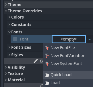
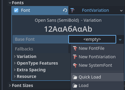
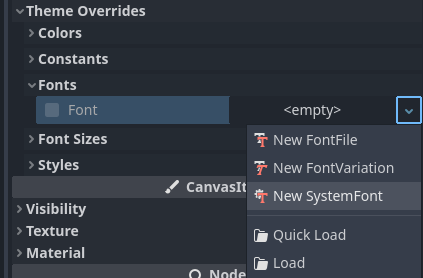
加载字体文件
要加载字体文件(动态字体或位图字体),请使用字体属性旁资源下拉菜单中的快速加载或加载选项,然后找到要使用的字体文件:
加载字体文件
你也可以将“文件系统”面板中的字体文件拖放至检查器中接受 Font 资源的属性。
警告
从 Godot 4.0 版本开始,纹理的过滤和重复属性由使用纹理的地方定义,不再由纹理自身定义,字体亦然(动态字体和位图字体都是这样)。
像素风格的字体应当禁用双线性过滤,做法是将项目设置 渲染 > 纹理 > 画布纹理 > 默认纹理过滤 改为 Nearest。
这种字体的大小必须是设计大小的整数倍(设计大小因字体而异),使用该字体的 Control 节点也必须采用整数倍缩放,否则字体看上去就会很模糊。Godot 中的字体大小使用像素(px)为单位,不使用点(pt)为单位。在不同软件之间比对字体大小时请务必注意这一点。
继承自 CanvasItem 的节点也可以单独设置纹理过滤模式,使用 CanvasItem.texture_filter 即可。
字体轮廓与阴影
如果无法提前预知背景色,那么使用字体轮廓和阴影就可以提升可读性。例如在 2D/3D 场景上绘制 HUD 元素时就是这样的情况。
大多数继承自 Control 的节点以及 Label3D 节点都可以使用字体轮廓功能。
在节点上启用字体轮廓的方法是在检查器中配置主题覆盖项 Font Outline Color 和 Outline Size。结果应该类似这样:
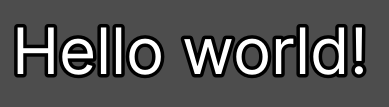
字体轮廓示例
备注
If using a font with MSDF rendering, its MSDF Pixel Range import option be set to at least twice the value of the outline size for outline rendering to look correct. Otherwise, the outline may appear to be cut off earlier than intended.
Support for font shadows is more limited: they are only available in Label and RichTextLabel. Additionally, font shadows always have a hard edge (but you can reduce their opacity to make them look more subtle). To enable font shadows on a given node, configure the Font Shadow Color, Shadow Offset X, and Shadow Offset Y theme overrides in a Label or RichTextLabel node accordingly:
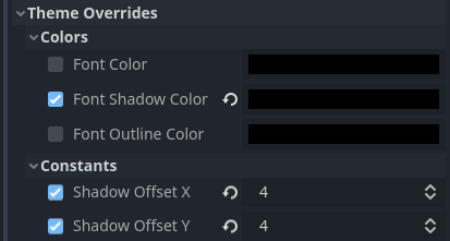
在 Label 节点中配置字体阴影
结果应如下所示:
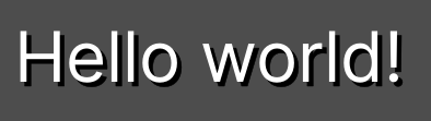
字体阴影示例
小技巧
You can create local overrides to font display in Label nodes by creating a LabelSettings resource that you reuse across Label nodes. This resource takes priority over theme properties.
高级字体特性
抗锯齿
You can adjust how the font should be smoothed out when rendering by adjusting antialiasing and hinting. These are different properties, with different use cases.
Antialiasing controls how glyph edges should be smoothed out when rasterizing the font. The default antialiasing method (Grayscale) works well on every display technology. However, at small sizes, grayscale antialiasing may result in fonts looking blurry.
The antialiasing sharpness can be improved by using LCD subpixel optimization, which exploits the subpixel patterns of most LCD displays by offsetting the font antialiasing on a per-channel basis (red/green/blue). The downside is that this can introduce "fringing" on edges, especially on display technologies that don't use standard RGB subpixels (such as OLED displays).
In most games, it's recommended to stick to the default Grayscale antialiasing. For non-game applications, LCD subpixel optimization is worth exploring.
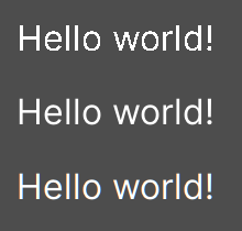
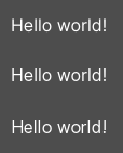
From top to bottom: Disabled, Grayscale, LCD Subpixel (RGB)
备注
MSDF 渲染的字体无法修改抗锯齿——这种字体始终使用灰度抗锯齿进行渲染。
微调
微调控制的是对字体进行栅格化的时候,字形边缘吸附到像素的程度。None看上去最平滑,字体较小时会看上去比较模糊。Light(默认值)只会在 Y 轴上对字形的边缘进行吸附,看上去会比较锐利,而 Full 则更加锐利,X 轴和 Y 轴都会进行边缘的吸附。对微调模式的选择取决于你个人的口味。
From top to bottom: None, Light, Full hinting
备注
If changing the hinting mode has no visible effect after clicking Reimport, it's usually because the font doesn't include hinting instructions. This can be resolved by looking for a version of the font file that includes hinting instructions, or enabling Force Autohinter in the Import dock. This will use FreeType's autohinter to automatically add hinting instructions to the imported font.
次像素定位
Subpixel positioning can be adjusted. This is a FreeType feature that allows glyphs to be rendered more closely to their intended form. The default setting of Auto automatically enables subpixel positioning at small sizes, but disables it at large font sizes to improve rasterization performance.
You can force the subpixel positioning mode to Disabled, One half of a pixel or One quarter of a pixel. One quarter of a pixel provides the best quality, at the cost of longer rasterization times.
Changing antialiasing, hinting and subpixel positioning has the most visible effect at smaller font sizes.
警告
Fonts that have a pixel art appearance should have their subpixel positioning mode set to Disabled. Otherwise, the font may appear to have uneven pixel sizes.
This step is not required for bitmap fonts, as subpixel positioning is only relevant for dynamic fonts (which are usually made of vector elements).
Mipmap
默认情况下字体不会生成 Mipmap,这样就能够降低内存占用、加速栅格化。但这样一来,缩小后的字体就会变成一坨。3D 文本 不启用 Fixed Size 的时候尤为明显。如果在 Control 节点中使用传统的栅格化字体(非 MSDF 字体)显示文本,并且该节点的缩放比 (1, 1) 要小,也会出现这种情况。
在“文件系统”面板中选中字体后,你可以在“导入”面板中启用 Mipmap,从而改善字体缩小渲染后的外观。
MSDF 字体也可以启用 Mipmap。在字体大小小于默认值时,这可以稍稍改善字体的渲染质量,但 MSDF 字体在放大后原本就是没有颗粒度问题的。
MSDF 字体渲染
多通道带符号距离场(Multi-channel signed distance field,MSDF)字体渲染能够将字体渲染为任意大小,无需在大小发生变化时重新栅格化。
与 Godot 默认使用的传统字体栅格化相比,MSDF 字体渲染有两个优点:
即便文字非常巨大,字体看上去也总是清晰的。
首次渲染大字号字体的字符时卡顿更短,因为无须执行栅格化。
MSDF 字体渲染的缺点有:
字体渲染的基础开销较高。桌面平台上通常无法察觉,但是会影响低端移动设备。
由于缺少微调,较小的字体没有栅格化字体清晰。
与传统的栅格化字体相比,首次为新字形渲染小字号字体的开销可能更大。可以使用 字体预渲染 缓解。
无法为 MSDF 字体启用 LCD 次像素优化。
MSDF 模式下无法正确渲染轮廓自相交的字体。如果使用从 Google Fonts 等处下载到的字体时出现渲染问题,请尝试改为从作者的官方网站下载。
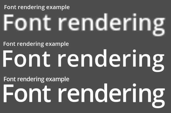
Comparison of font rasterization methods. From top to bottom: rasterized without oversampling, rasterized with oversampling, MSDF
To enable MSDF rendering for a given font, select it in the FileSystem dock, go to the Import dock, enable Multichannel Signed Distance Field, then click Reimport:

Enabling MSDF in the font's import options
使用 Emoji
Godot 对 Emoji 字体的支持有限:
支持 CBDT/CBLC(内嵌 PNG)和 SVG Emoji 字体。
不支持 COLR/CPAL Emoji 字体(自定义矢量格式)。
不支持 EMJC 位图压缩(iOS 系统 Emoji 字体需要用到)。这意味着如果要在 iOS 上支持 Emoji,你就必须改用自定义的使用 SVG 或 PNG 位图压缩的字体。
For Godot to be able to display emoji, the font used (or one of its fallbacks) needs to include them. Otherwise, emoji won't be displayed and placeholder "tofu" characters will appear instead:
尝试在标签中使用 Emoji 的默认外观
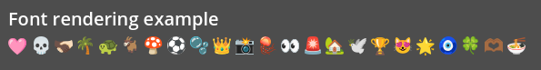
After adding a font to display emoji such as Noto Color Emoji, you get the expected result:
为标签添加 Emoji 字体后的正确外观
To use a regular font alongside emoji, it's recommended to specify a fallback font that points to the emoji font in the regular font's advanced import options. If you wish to use the default project font while displaying emoji, leave the Base Font property in FontVariation empty while adding a font fallback pointing to the emoji font:
小技巧
Emoji fonts are quite large in size, so you may want to load a system font to provide emoji glyphs rather than bundling it with your project. This allows providing full emoji support in your project without increasing the size of its exported PCK. The downside is that emoji will look different depending on the platform, and loading system fonts is not supported on all platforms.
也可以将系统字体用作回退字体。
使用图标字体
Tools like Fontello can be used to generate font files containing vectors imported from SVG files. This can be used to render custom vector elements as part of your text, or to create extruded 3D icons with 3D 文本 and TextMesh.
备注
Fontello currently does not support creating multicolored fonts (which Godot can render). As of November 2022, support for multicolored fonts in icon font generation tools remains scarce.
Depending on your use cases, this may lead to better results compared to using
the img tag in RichTextLabel. Unlike
bitmap images (including SVGs which are rasterized on import by Godot),
true vector data can be resized to any size without losing quality.
After downloading the generated font file, load it in your Godot project then specify it as a custom font for a Label, RichTextLabel or Label3D node. Switch over to the Fontello web interface, then copy the character by selecting it then pressing Ctrl + C (Cmd + C on macOS). Paste the character in the Text property of your Label node. The character will appear as a placeholder glyph in the inspector, but it should appear correctly in the 2D/3D viewport.
To use an icon font alongside a traditional font in the same Control, you can specify the icon font as a fallback. This works because icon fonts use the Unicode private use area, which is reserved for use by custom fonts and doesn't contain standard glyphs by design.
备注
Several modern icon fonts such as Font Awesome 6
have a desktop variant that uses ligatures to specify icons. This allows you to
specify icons by entering their name directly in the Text property of any
node that can display fonts. Once the icon's name is fully entered as text
(such as house), it will be replaced by the icon.
While easier to use, this approach cannot be used with font fallbacks as the main font's characters will take priority over the fallback font's ligatures.
字体回退
Godot 支持定义一个或更多的回退字体,会在主字体缺失要显示的字形时使用。定义回退字体主要有两种用途:
使用仅支持拉丁字符集的字体,需要显示西里尔字母等其他字符集的文本时使用另一种字体。
使用一种字体渲染文本,使用另一种字体渲染 emoji 和图标。
Open the Advanced Import Settings dialog by double-clicking the font file in the FileSystem dock. You can also select the font in the FileSystem dock, go to the Import dock then choose Advanced… at the bottom:
导入面板
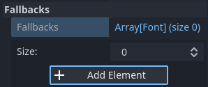
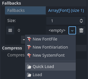
在出现的对话框中,找到右侧的 回退 部分,点击 Array[Font](大小 0)字样展开属性,然后点击添加元素:
添加字体回退
点击新元素上的下拉箭头,然后使用快速加载或加载选项选择字体文件:
加载字体回退
使用默认项目字体时也可以添加回退字体,做法是将 Base Font 留空,同时添加一个或多个字体回退。
备注
字体回退也可以单独定义,做法和 OpenType 字体特性 类似,这里不再赘述。
可变字体
Godot 提供了对可变字体的完整支持,可变字体能够用单个字体文件表示不同的字重和样式(常规、加粗、斜体等)。该功能需要字体文件本身支持可变字体。
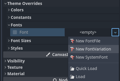
使用可变字体时,请在需要使用字体的地方创建 FontVariation 资源,然后在该 FontVariation 资源中加载字体文件:
创建 FontVariation 资源
为 FontVariation 资源加载字体文件
向下滚动到 FontVariant 的 Variation 部分,然后点击 变体坐标 字样展开可调节轴的列表:
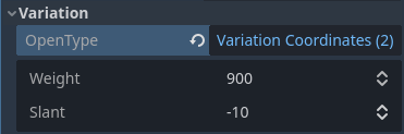
可变轴列表
能够调整哪些轴取决于加载的字体。有些可变字体仅支持单轴调整(通常是字重或倾斜),有些可变字体则会支持多轴调整。
例如,Inter V 字体将字重设置为 900、倾斜设置为 -10 时是这样的:

可变字体示例(Inter V)
小技巧
While variable font axis names and scales aren't standardized, some common conventions are usually followed by font designers. The weight axis is standardized in OpenType to work as follows:
Axis value |
Effective font weight |
|---|---|
|
Thin (Hairline) |
|
Extra Light (Ultra Light) |
|
Light |
|
Regular (Normal) |
|
Medium |
|
Semi-Bold (Demi-Bold) |
|
Bold |
|
Extra Bold (Ultra Bold) |
|
Black (Heavy) |
|
Extra Black (Ultra Black) |
你可以将 FontVariation 保存为 .tres 资源文件,这样就能够在其他地方重复使用了:
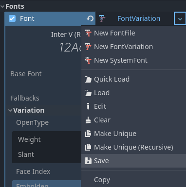
将 FontVariation 保存为外部资源文件
假粗体和假斜体
在使用粗体和斜体字时,使用专门设计的字体变体可以产生更好的视觉效果。粗体字体中的字形间距更为一致,而斜体字体中的某些字形与正常字体完全不同(对比 "a" 和 "a")。
然而,使用真正的粗体和斜体字体需要更多的字体文件,导致发布文件大小增大。也可以使用单个 可变字体 文件,但该文件将会大于正常的单个不可变字体文件。文件大小在桌面版项目上通常不足为虑,但在意图保持分配文件大小尽可能小的移动 / web 版项目上可能成为问题。
为了在不需要发布额外字体(或者使用单个更大的字体文件)的情况下支持粗体和斜体,Godot 中支持 假 粗体和斜体。
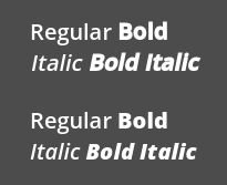
假粗体 / 斜体(上),真粗体 / 斜体(下)。使用的正常字体:Open Sans SemiBold
如果没有为粗体和斜体提供自定义字体,则 RichTextLabel 中的粗体和斜体标签将自动使用假粗体和斜体。
若要使用假粗体,在需要 Font 资源的栏目中创建 FontVariation 资源。将 Variation > Embolden 设定为正值会加粗字体,而设定为负值则会让字体变细。建议采用 0.5 和 1.2 之间的值,具体视字体而定。
假斜体由歪斜字体创建,通过修改每个字符的变换实现。该功能同样由 FontVariation 提供,使用的是 Variation > Transform 属性。将字符变换中的 yx 分量设为一个正值会创建斜体效果。建议采用 0.2 和 0.4 之间的值,具体视字体而定。
调整字体间距
为了某些艺术效果,或提高可阅读性,你可能会想要调整 Godot 中显示字体的方式。
在需要 Font 资源的栏目中创建 FontVariation 资源。其中 Variation > Extra Spacing 部分有 4 个可用属性,均可接受正值和负值:
Glyph: 每个字形之间的额外间距。
Space: 单词之间的额外间距。
Top: Additional spacing above glyphs. This is used for multiline text, but also to calculate the minimum size of controls such as Label and Button.
Bottom: Additional spacing below glyphs. This is used for multiline text, but also to calculate the minimum size of controls such as Label and Button.
还可以调节 Variation > Transform 来对字符进行拉伸。具体方式是调节 xx (横向缩放) and yy (纵向缩放) 分量。由于字形变换不会影响每个字形在文本中所占据的空间,使用时应切记进行相应的字形间距调整。因为大部分字体并非是为了在被拉伸环境下显示而设计,这种非均一的拉伸应谨慎使用。
OpenType 字体特性
Godot 支持启用 OpenType 字体特性,这是一种标准化的方式,可以在不切换完整字体文件的情况下进行替代字符的切换。虽然其名称是 OpenType 字符特性,但同样也支持 TrueType (.ttf) 和 WOFF/WOFF2 字体文件。
对 OpenType 特性的支持高度取决于所使用的字体。某些字体完全不支持 OpenType 特性,而另一些可以支持数十个可切换的特性。
使用 OpenType 字体特性有 2 种方法:
针对字体文件全局设置
Open the Advanced Import Settings dialog by double-clicking the font file in the FileSystem dock. You can also select the font in the FileSystem dock, go to the Import dock then choose Advanced… at the bottom:
导入面板
在出现的对话框中,找到右侧侧边栏中的 元数据覆盖 > OpenType 特性 部分,点击 特性(0/N) 字样展开属性,然后点击 添加特性:
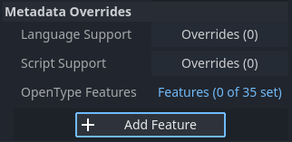
高级导入设置中的 OpenType 特性覆盖
针对字体用例设置(FontVariantion)
使用字体特性时,请和使用可变字体时一样创建 FontVariant 资源,然后在 FontVariation 资源中加载字体文件:
创建 FontVariation 资源
在 FontVariation 资源中加载字体文件
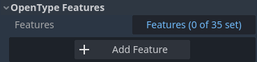
滚动到 FontVariation 的 OpenType Features 部分,点击 特性(0/N) 字样展开属性,然后点击 添加特性,在下拉列表中选择所需的特性:
在 FontVariation 资源中指定 OpenType 特性
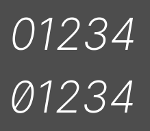
以 Inter 字体为例,下图中展示的是不带 Slashed Zero 特性(上)和启用 Slashed Zero OpenType 特性(上)的效果:
OpenType 特性比较(Inter)
可以通过添加 OpenType 特性后在检查器中取消勾选相应特性,为特定字体禁用连字和 / 或字偶剧:
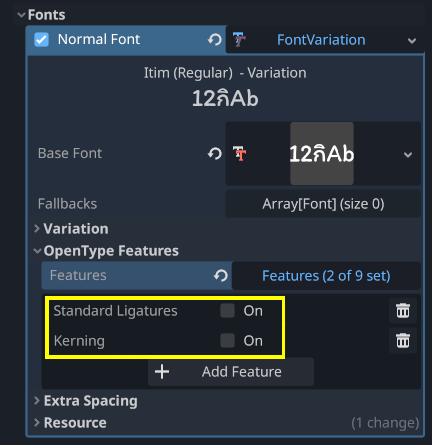
禁用字体的合字和字偶距
系统字体
警告
只有 Windows、macOS、Linux、Android、iOS 支持加载系统字体。
然而,Android 上加载系统字体不可靠,因为没有官方 API 提供支持。Godot 需要依靠解析系统配置文件,而这些文件可能会被第三方 Android 供应商修改。这可能导致系统字体加载不起作用。
System fonts are a different type of resource compared to imported fonts. They are never actually imported into the project, but are loaded at runtime. This has 2 benefits:
这些字体不包含在导出的 PCK 文件中,使得导出项目的文件大小更小。
这些字体不包含在导出项目中,可以避免将专有系统字体随项目发布所导致的许可问题。
引擎会自动使用系统字体作为回退字体,因此不加载自定义字体也能够显示中日韩字符以及 emoji。不过仍然会有一些限制,见使用 emoji 中的相关内容。
需要使用系统字体的地方,请创建 SystemFont 资源:
创建 SystemFont 资源
指定 SystemFont 资源中使用的字体名称
你可以显式指定若干字体名称(例如 Arial),也可以指定字体的别名,后者会映射到系统中的“标准”默认字体:
字体别名 |
Windows |
macOS/iOS |
Linux |
Android |
|---|---|---|---|---|
|
Arial |
Helvetica |
由 fontconfig 处理 |
Roboto / Noto Sans |
|
Times New Roman |
Times |
由 fontconfig 处理 |
Noto Serif |
|
Courier New |
Courier |
由 fontconfig 处理 |
Droid Sans Mono |
|
Comic Sans MS |
Apple Chancery |
由 fontconfig 处理 |
Dancing Script |
|
Gabriola |
Papyrus |
由 fontconfig 处理 |
Droid Sans Mono |
在 Android 上,拉丁、西里尔文本会使用 Roboto,中日韩等其他语言的字形会使用 Noto Sans。如果是第三方 Android 发行版,实际的字体可能会不同。
如果指定了多个字体,则会使用系统中(按从上至下的顺序)找到的第一个字体。所有平台上的字体名称和别名都不区分大小写。
和字体变体一样,你可以将 SystemFont 配置保存为资源文件,在其他地方使用。
请注意,不同系统字体的度量系统不同,也就是说,在一个平台上能够放进某个矩形的一段文本可能在另一个平台上就放不进。请在开发过程中保留足够的空间,让文本标签能够在按需扩展。
备注
与 Windows 和 macOS/iOS 不同,Linux 系统上默认提供哪些字体取决于发行版。也就是说,同样的系统字体名称和别名在不同的 Linux 发行版上可能会使用不同的字体显示。
运行时也可以加载字体,即便是未在系统中安装的字体也可以加载。详见《运行时加载与保存》。
字体预渲染
使用传统的栅格字体时,Godot 会针对不同字体的不同尺寸进行字形的缓存。这样做能够减轻卡顿,但卡顿仍然会在项目的运行过程中首次显示某个字形时发生。如果使用的是较大的字体大小,或者是在移动设备上运行,就会尤为明显。
使用 MSDF 字体时,只需要执行一次特殊的带符号距离场纹理栅格化。这样就可以单纯针对字体进行缓存,无需考虑字体大小。不过 MSDF 字体的首次渲染相对于中等大小的传统栅格字体要慢。
为了避免与字体渲染相关的卡顿问题,可以对特定的字形进行预渲染。可以针对所有需要使用的字形进行预渲染(得到最优的效果),也可以只针对游戏中可能出现的常见字形进行预渲染(降低文件尺寸)。没有预渲染的字形会照常进行即时栅格化。
备注
无论是传统字体还是 MSDF 字体,栅格化都是在 CPU 上进行的。也就是说 GPU 的性能并不会影响字体栅格化的耗时。
Open the Advanced Import Settings dialog by double-clicking the font file in the FileSystem dock. You can also select the font in the FileSystem dock, go to the Import dock then choose Advanced… at the bottom:
导入面板
前往“高级导入设置”对话框的预渲染配置选项卡,单击“加号”添加配置:
在“高级导入设置”对话框中添加新的预渲染配置
添加配置后,请单击对应的名称,确保选中该配置。双击名称可以重命名该配置。
在配置中添加字形的方法有两种。两种方法可以同时使用,效果会累积:
使用翻译中的文本
对于大多数项目而言,使用这个方法最方便,因为可以从语言翻译中自动提取文本。缺点是只有项目支持国际化时才能使用。否则请使用下面“使用自定义文本”的方法。
After adding translations to the Project Settings, use the Glyphs from the Translations tab to check translations by double-clicking them, then click Shape All Strings in the Translations and Add Glyphs at the bottom:
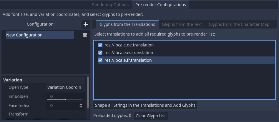
Enabling prerendering in the Advanced Import Settings dialog with the Glyphs from the Translations tab
备注
The list of prerendered glyphs is not automatically updated when translations are updated, so you need to repeat this process if your translations have changed significantly.
使用自定义文本
While it requires manually specifying text that will appear in the game, this is the most efficient approach for games which don't feature user text input. This approach is worth exploring for mobile games to reduce the file size of the distributed app.
To use existing text as a baseline for prerendering, go to the Glyphs from the Text sub-tab of the Advanced Import Settings dialog, enter text in the window on the right, then click Shape Text and Add Glyphs at the bottom of the dialog:
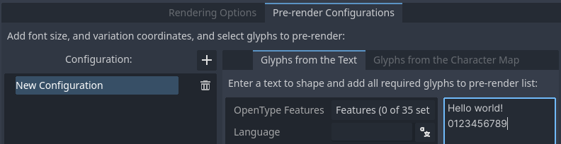
Enabling prerendering in the Advanced Import Settings dialog with the Glyphs from the Text tab
小技巧
If your project supports internationalization, you can paste the contents of your CSV or PO files in the above box to quickly prerender all possible characters that may be rendered during gameplay (excluding user-provided or non-translatable strings).
通过启用字符集
The second method requires less configuration and fewer updates if your game's text changes, and is more suited to text-heavy games or multiplayer games with chat. On the other hand, it may cause glyphs that never show up in the game to be prerendered, which is less efficient in terms of file size.
To use existing text as a baseline for prerendering, go to the Glyphs from the Character Map sub-tab of the Advanced Import Settings dialog, then double-click character sets to be enabled on the right:

Enabling prerendering in the Advanced Import Settings dialog with the Glyphs from the Character Map tab
To ensure full prerendering, the character sets you need to enable depend on which languages are supported in your game. For English, only Basic Latin needs to be enabled. Enabling Latin-1 Supplement as well allows fully covering many more languages, such as French, German and Spanish. For Russian, Cyrillic needs to be enabled, and so on.
默认项目字体属性
在高级“项目设置”的 GUI > 主题部分中,可以对默认字体的渲染方式进行选择:
Default Font Antialiasing: Controls the antialiasing method used for the default project font.
Default Font Hinting: Controls the hinting method used for the default project font.
Default Font Subpixel Positioning: Controls the subpixel positioning method for the default project font.
Default Font Multichannel Signed Distance Field: If
true, makes the default project font use MSDF font rendering instead of traditional rasterization.Default Font Generate Mipmaps: If
true, enables mipmap generation and usage for the default project font.
备注
These project settings only affect the default project font (the one that is hardcoded in the engine binary).
Custom fonts' properties are governed by their respective import options instead. You can use the Import Defaults section of the Project Settings dialog to override default import options for custom fonts.